
 España
 France
 Italia


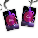


You are holding a PVC card in your hands: does it inspire trust, dynamism or exclusivity? Every visual element conveys a precise message. To make sure your PVC cards are truly personalised, start by aligning the colours with your brand’s visual identity. What colour palette have you already defined across your communication materials? Use it to create a consistent visual thread.
Colours also play a deeply emotional role. Blue conveys security, red stimulates action, green suggests balance. Are you targeting a young audience eager for visual freshness, or professional profiles seeking sobriety?
Also consider ergonomics: contrast between background and text greatly improves readability. White typography on a dark background remains legible at a glance, even from a distance. Do not let visual finish compromise the primary function of the card: conveying information clearly and quickly.
What message do you want to communicate at first glance? The right choice of colours allows you to express it without a single word.
Choose typefaces that enhance your card at first glance
Choose clear, no‑frills fonts
Ask yourself what your card needs to say in the first few seconds. A sans‑serif font such as Roboto, Helvetica Neue or Montserrat will ensure smooth reading on a surface as small as PVC cards. These typefaces offer excellent legibility, even when you reduce the text size.
Avoid overly decorative fonts
Have you ever tried to decipher a decorative font on a small format? Stylised fonts such as Script MT Bold or Brush Script reduce information clarity. Limit the use of original fonts to very short headings or insignificant message elements. Core content always deserves a clean presentation.
Hierarchical use of headings, subheadings and contact details
Structure your content to guide the eye. Use a larger size and heavier weight for the company name or the cardholder’s role. Reserve a secondary style for subheadings such as department or slogan. Present contact details in an even more discreet but consistent typeface.
- Company name: Roboto Bold, 11 pt
- Job title: Roboto Medium, 9 pt
- Contact details: Roboto Regular, 8 pt
Font size suited to card format
PVC cards generally measure 85.60 mm by 53.98 mm. Within this limit, typography that is too small will become illegible. Apply a minimum size of 7 to 8 points for secondary information, and increase it to 9 to 11 points for priority elements. Have you tested your design printed at real scale? This will immediately reveal the necessary adjustments.
How your branding can transform ordinary PVC cards into a powerful medium
Add your logo in high definition
Place your logo visibly without harming the readability of other content. Use a vector file (SVG, AI or EPS format) to guarantee perfect print resolution. A blurry or pixelated logo will immediately reduce the perceived value of the card. What size should the logo be to remain impactful without feeling intrusive? Test several layouts before printing.
Strictly respect your brand colour palette
Use the exact colour codes from your brand guidelines. Work in CMYK colour mode (Cyan Magenta Yellow Black) to match professional printing standards. This chromatic accuracy instantly strengthens brand recognition. Have you checked that your card background colour does not interfere with text readability?
Integrate your pictograms and visual identity elements
Add graphic elements specific to your visual universe: pictograms, product‑specific icons, recurring patterns. By positioning them methodically, you create an immersive design. These elements should remain discreet yet consistent. Where do you place your pictograms so they support the message without diverting attention?
Align your PVC cards with all your communication materials
Ensure your card fits seamlessly into the continuity of your other media: packaging, advertising visuals, POS materials, physical signage. When customers hold your card, they should instantly recognise the graphic universe that represents you. Compare the card with your brochures and your website. What do you notice? Visual discrepancies? Adjust them before approving your print model.
Organise information with logic and clarity
Present information in the expected order
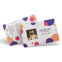
You immediately capture visual attention by structuring data according to a clear hierarchy. Start with the surname, followed by the first name, then indicate the job title within the company. Next, include the company name, and finish with full professional contact details : phone number, email address, website.
This organisation naturally guides the eye without causing confusion. You avoid forcing your potential client to search for essential information within a disordered text block.
Use areas that naturally attract the eye
Have you noticed that your eye instinctively goes to the top‑left corner or the centre of a card? Use this dynamic. Place the name and job title in these areas. Reserve lower or side corners for secondary information such as contact details. This visual logic leverages reading habits and improves immediate understanding.
Keep breathing space: space out and simplify
Do you want your card to breathe and capture attention without visual fatigue? Separate each block of information with balanced margins. Avoid stacking too much text or unnecessary decorative elements. By choosing a clean design, you make it easier to quickly identify each piece of data and increase its impact.
Are you hesitating to remove a decorative element? Test without it, then observe the effect. You will see that minimalism strengthens memorability.
Enhance your PVC cards with high‑definition visuals
Why aim for at least 300 DPI
You ensure flawless print sharpness by importing your visuals at 300 DPI. This resolution level eliminates any risk of blurring, even on fine details such as background textures or handwritten signatures. Ask yourself a simple question: does your image retain the same sharpness on screen as it does when zoomed to 100% in your design software? If not, replace it.
Which file formats to prioritise for logos
You preserve the integrity and quality of your logo by choosing vector formats. Prefer:
- SVG : infinitely scalable, very lightweight and compatible with most design tools
- AI : Adobe Illustrator’s native format, ideal for precise adjustments
- PNG : only if you need to retain transparency without access to a vector file
Avoid JPEGs, even in high resolution. They compress data and create unattractive artefacts in print.
What your image says about your company
You directly influence brand perception with the card’s main visual. Ask yourself this question: does your image convey your product range’s graphic universe or positioning? For example, a card intended for a sports club should immediately evoke energy, performance or community. A lack of graphic consistency between your visual and your identity creates a noticeable dissonance.
How to validate your visuals before launch
Always run a series of print tests before any final production. Select different print finishes (matt, gloss) to assess how light interacts with your visuals. Then check colour density, readability of light gradients and edge sharpness. Have you already evaluated the impact of your visual under natural and artificial light? This simple test helps you avoid contrast errors that are often invisible on screen.
Adapt your PVC cards to those who receive them
Who is your card intended for?
Ask yourself this question before approving your design. You will not design PVC cards in the same way for a CEO and for a student. The former expects a sober, discreet visual with neutral colours such as anthracite grey or navy blue. The latter will be drawn to dynamic graphics with bright or contrasting tones.
Start by identifying the exact profile of your recipients: permanent staff, clients, occasional visitors, contractual partners. Then translate this data into your graphic style.
How to visually adapt a card to its audience?
- For employees : Display the name, department and role. Add a photo to strengthen identification. Integrate a colour code by department or hierarchical level.
- For customers : Prioritise a premium aesthetic with high‑quality printing. You can integrate a QR code leading to their personalised benefits.
- For visitors : Prioritise readability with the name, date and host identity on the card. Also plan highly visible colours to make recognition easier for your staff.
- For partners : Choose a balanced layout that reflects your brand guidelines. Optionally insert a welcome message or a collaboration promise.
Strengthen impact with personalised elements
Systematically integrate variables specific to each holder: first name, photo, employee number, access level or role. Use a dynamic identifier field if you generate a large number of cards from a database.
These individualised elements strengthen engagement, internal recognition and security. They also give your card a much more professional appearance.
Consider promotional‑use cards
Are you launching a marketing campaign or a new service? Print it directly on the PVC cards intended for customers or prospects. For example, a loyalty cards may display a call‑to‑action message such as: “10% off your next purchase – Offer valid until 30 September 2024”.
You will achieve two objectives in a single action: identifying your customer while encouraging their next conversion.
Make a difference with the right design tools
Have you ever wasted time reworking a design that did not print correctly? To avoid unpleasant surprises, choose the right software from the outset and apply the precise settings required for PVC card printing.
Which software should you prioritise for a professional design?
- Adobe Illustrator : Ideal for creating crisp vector files, perfectly suited to the curves of PVC cards. You control every element with precision.
- Adobe Photoshop : Use it to manage complex visuals or texture effects. Combine it with Illustrator for optimal results.
- Adobe InDesign : Useful for projects requiring multiple versions or mass personalisation. Its templates simplify element repetition.
- Canva Pro : If you are looking for a fast and accessible solution, Canva offers print‑ready templates, but limit yourself to simple projects.
Why starting from a calibrated template will save you time
Predefined templates already include dimensions, crop marks and bleed margins. By downloading a ready‑to‑use template from your printer or from official Adobe or Canva libraries, you ensure compliance with PVC printing standards from the very first version.
Do you need to install specific plugins?
Yes. Some plugins speed up the process:
- Mockup Everything (Photoshop) : preview your card in real‑life situations.
- Esko Studio : Illustrator plugin to simulate embossing, foiling or spot varnish used on premium cards.
- Lucidpress or CardWorks : offer online business card templates with correct DPI format and CMYK colours.
Work exclusively in CMYK mode
Set up your workspace in four‑colour process (Cyan Magenta Yellow Black). Unlike RGB intended for digital display, CMYK reflects real colours on physical media. This conversion prevents colour discrepancies between your screen and the printed card.
Ask yourself this question: will your design pass the card proof stage?
This test allows you to validate the chosen tools, layer alignment, minimum resolution (300 dpi) and colour accuracy. Produce a paper or digital proof with the correct settings to detect final corrections before PVC printing.
We also recommend these pages: